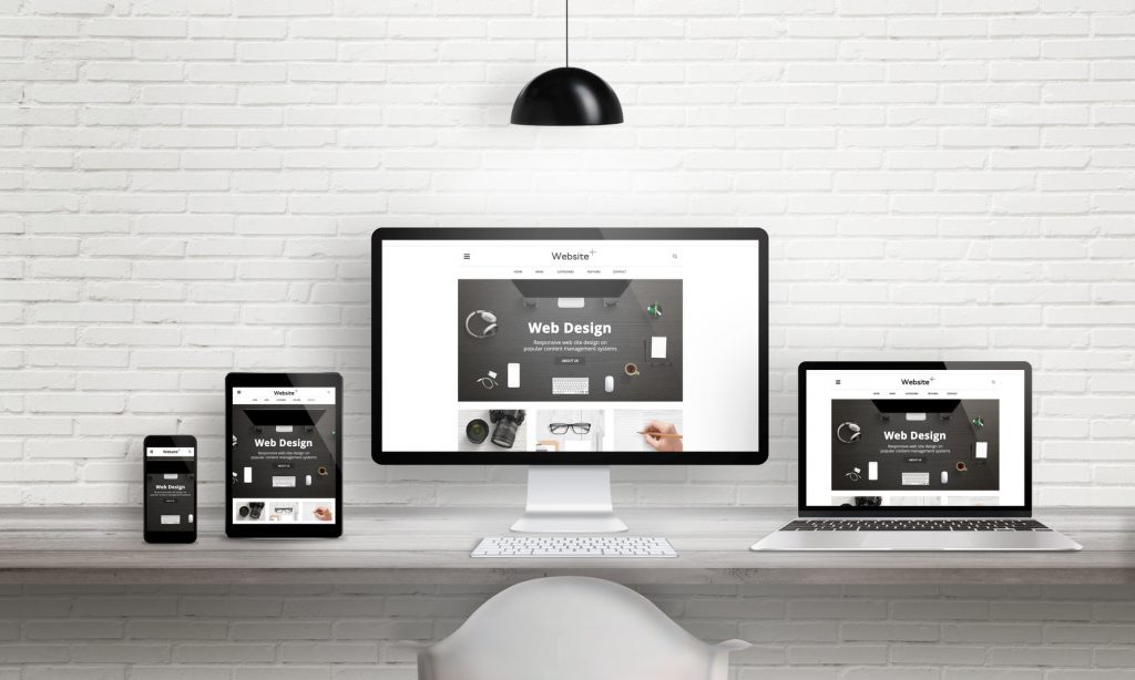
 Over 50% of Google users refuse to recommend a business that has a badly designed mobile website.
While that statistic may seem harsh, it’s a sign of the times. The average American now spends almost 5 hours per day on their smartphone. As a result, small businesses are updating their sites to accommodate growing mobile preferences.
This article will look at 5 small business web design trends you should be paying attention to. Read on to find out how you can adapt before your competitors do!
1. Minimalism
Over the past couple of years, extravagant designs have fallen out of favor with many internet users. As a result, people are now embracing more minimalist designs—and for good reason.
When it comes to web design, minimalism offers some solid perks. For starters, it increases website speed. This is critical, as over half of mobile users exit a web page if it loads for longer than 3 seconds. Additionally, minimalist designs also make web pages feel crispier and more responsive.
However, for some, minimalist designs can lead to a monotonous look. To avoid this problem, consider using a few brighter colors. Doing so injects some personality into an otherwise dull-looking page.
2. Grid Layouts
Mobile isn’t the only thing influencing small business web design trends. Social media is, too.
Due to the success of Pinterest, many businesses are taking advantage of the grid layout. Ultimately, it’s simple and easy to navigate.
While this layout won’t work for all businesses, many e-commerce sites can benefit. Plus, it might be a good idea to consider using it on one or two pages either way.
3. Parallax Scrolling
If you want to add depth to your web pages, try parallax scrolling. This subtle technique involves moving background images slower than those in the foreground.
Chili Pepper Design website development, for example, use parallax scrolling on their homepage. It adds a sense of animation and makes you want to stay on the site longer.
However, parallax scrolling isn’t just great for aesthetics. It’s also helpful for mobile users. The technique allows mobile visitors to consume your content without having to constantly switch from page to page.
4. Chatbots
If you haven’t heard already, chatbots are taking over. In fact, 80% of businesses wish to utilize chatbots by 2020.
Chatbots are the small, interactive windows found in the corner of many websites. They offer support and information to visitors.
To avoid issues, make the popup window as nonintrusive as possible. Also, ensure that it’s easy to close as well. This way, it only stays on the screen for those who truly need help.
5. Larger Font Size
When considering what font to use for your site, readability is a deciding factor. That said, what looks good on a laptop may not look so good on a smartphone or tablet.
However, a bigger font can help you solve this problem. It helps mobile visitors scan your content more easily.
To improve scannability even more, try incorporating more white space as well. This allows readers rest their eyes.
Final Thoughts on Small Business Web Design Trends
Embracing a few small business web design trends can help keep your bounce rate low, as visitors have more reasons to explore your site. This is critical for maintaining a high ranking on search engines.
Remember that a minimalist design has several benefits. Also, keep in mind that parallax scrolling not only makes your site more visually appealing, but it also adds to the mobile experience.
Check out some of our other SEO articles to learn about more ways to improve your website!

