It is not only web designers and developers, who need to adapt to
webcomake changes to their strategies and tactics, if they want to capture
the lucrative mobile search market. Mobile search is a constantly
growing segment of the market, which is good news. However, mobile
search has its own rules and they are kind of different from the
rules of traditional desktop search. This is why if you don't want to
miss mobile searchers, you need to adapt to their requirements. Here
are some very important rules to consider when optimizing for mobile
search:
1 Mobile Searchers Use Shorter Keyphrases/Keywords
Mobile users search for shorter keyphrases, or even just for
keywords. Even mobile devices with QWERTY keyboards are awkward for
typing long texts and this is the reason why mobile searchers usually
are very brief in their search queries. Very often the search query
is limited to only 2 or even 1 words. As a result, if you don't rank
well for shorter keyphrases (unfortunately, they are also more
competitive), then you will be missing a lot of mobile traffic.

2 Mobile Search Is Mainly Local Search
Mobile users search mostly for local stuff. In addition to shorter
search keyphrases, mobile searchers are also locally targeted. It is
easy to understand - when a user is standing in the street and is
looking for a place to dine, he or she is most likely looking for
things in the neighborhood, not in another corner of the world.
Searches like “pizza 5th Avenue” are quite popular, which
makes local search results even more important to concentrate on.
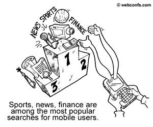
3 Current Data Rules in Mobile Search

Sports results, news, weather, financial information are among the
most popular mobile search categories. The main topics and niches
mobile users prefer are kind of limited but again, they revolve
around places to eat or shop in the area, sports results, news,
weather conditions, market information, and other similar topics
where timing and location are key. If your site is in one of these
niches, then you really need to optimize it because if your site is
not mobile-friendly chances are you are losing visitors. You could
even consider having two separate versions of your site – one
for desktop searchers and one for mobile searchers.
4 In Mobile Search, Top 10 Is Actually Top 3
Users hate to scroll down long search pages or hit Next, Next,
Next. Desktop searchers aren't fond of scrolling endless pages either
but in mobile search the limitations are even more severe. A page
with 10 search results fits on the screen of a desktop but on a
mobile device it might be split into 2 or more screens. Therefore, in
mobile search, it is not Top 10, it is more Top 4, or even Top 3
because only the first 3 or 4 positions are on the first page and
have a higher chance to attract the user's attention without having
to go to the next page.
5 Promote Your Mobile-Friendly Site
Submit your site to major mobile search engines, mobile portals,
and directories. It is great if your visitors come from Google and
the other major search engines but if you want to get even more
traffic, mobile search engines, mobile portals, and directories are
even better. For now these mobile resources work great to bring
mobile traffic, so don't neglect them. Very often a mobile user
doesn't search with Google, but goes to a portal he or she knows. If
your site is listed with this portal, the user will come directly to
you from there, not from a search engine. The case with directories
is similar – i.e. if you are optimizing the site of a pizza
restaurant, then you should submit it to all directories where pizza
restaurants and restaurants in general for your location are listed.

6 Follow Mobile Standards
Mobile search standards are kind of different and if you want your
site to be spiderable, you need to comply with them. Check the
guidelines of W3C to
see what mobile standards are. Even if your site doesn't comply with
mobile standards, it will still be listed in search results but it
will be transcoded by the search engine and the result could be
pretty shocking to see. Transcoders convert sites to a mobile format
but this is not done in a sophisticated manner and the output might
be really unbelievable – and everything but mobile-friendly.
7 Don't Forget Meta.txt
Meta.txt is a special file, where you briefly describe the
contents of your site and point the user agent to the most
appropriate version for it. Search engine spiders directly index the
meta.txt file (provided it is located in the root directory), so even
if the rest of your site is not accessible, you will still be
included in search results. Meta.txt is similar to robots.txt in
desktop search but it also has some similarity with metatags because
you can put content it it (as you do with the Description and
Keywords metatags). The format of the meta.txt file is
colon delimited (as is the format of robots.txt). Each field in the
file has the following syntax form <fieldname>:<value>.
One of the advantages of meta.txt is that it is easily parsed by
humans and search engines.
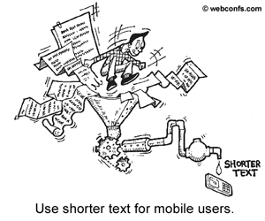
8 No Long Pages for Mobile Searchers
Use shorter texts because mobile users don't have the time to read
lengthy pages. We already mentioned that mobile searchers don't like
lengthy keyphrases. Well, they like lengthy pages even less! This is
why, if you can make a special, shorter mobile version of your site,
this would be great. Short pages don't mean that you should skip your
keywords, though. Keywords are really vital for mobile search, so
don't exclude them but don't keyword stuff, either.
9 Predictive Search Is Popular With Mobile Searchers
Use phrases, which are common in predictive search. Predictive
search is also popular with mobile searchers because it saves typing
effort. This is why, if your keywords are among the common predictive
search results, this seriously increases your chances to be found. It
is true that predictive search keywords change from time to time and
you can't always follow them but you should at least give it a try.
10 Preview Your Site on Mobile Devices
Always check how your site looks on a mobile device. With the
plethora of devices and screen sizes it is not possible to check your
site on absolutely every single device you can think of, but if you
can check it at least on a couple of the most important ones, this is
more than nothing. Even if you manage to get visitors from mobile
search engines, if your site is shown distorted on a mobile screen,
these visitors will run away. Transcoding is one reason why a site
gets distorted, so it is really a good idea to make your site
mobile-friendly instead of to rely on search engines to transcode it
and make it a design nightmare in the process.
Mobile search is relatively new but it is a safe bet that it will
get a huge boost in the near future. If you are uncertain whether
your particular site deserves to be optimized for mobile devices or
not, use AdWords Keyword Research Tool to track mobile volumes for
your particular keywords. If the volumes are high, or if a particular
keyword is doing remarkably well in the mobile search segment, invest
more time and effort to optimize for it.


