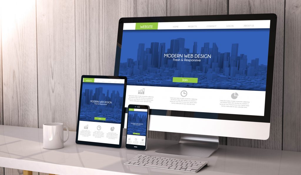
In a world in which the average consumer is exposed to 5,000 brands a day, designing a website that stands out is more important than ever.
These days, internet connections are fast, and attention spans are slow. If your website doesn’t have an attractive design, your visitors won’t stay.
So, how do you build an attractive design? In this article, we’ll talk about eight key features of a well-designed website.
So, read on and learn how to design a website that stands out.
Keep it Simple
This is the first rule of web design. First and foremost, your website should be simple and easy to understand. So, keep your creative energy on a leash.
That goes double for your home page. Unless you have a well-established brand (think Amazon), you don’t want a busy homepage.
A busy site will take longer to load, which means you’ll lose customers. And even if they can stomach the extra wait time, they’ll leave once they see how information heavy your site is.
Make your homepage sleek and stylish. Show your customers only what they need to see and no more.
If your design is professional and attractive, they’ll stick around long enough to learn about your brand. You don’t need to shove it down their throat.
Focus on Navigation
So, your homepage is simple enough that it isn’t scaring your customers away. Now, how do you help them get to where they need to go?
Most importantly, make sure your navigation menu is easy to find. The user shouldn’t have to scroll to find it, and it should be separate from everything else on the page. Putting a horizontal navigation menu at the top is always a good choice.
Make sure your navigation menu isn’t cluttered. The main menu should have only a few categories. Use drop-down menus if you want more specifics within each category.
Visitors should be able to get to where they need to go in as few clicks as possible. The longer they spend searching, the more likely they are to leave.
Minimize Options
Part of designing a simple, easy-to-navigate site is limiting your visitors’ options. Don’t show them all your content at once. And divide up the content you do show them, so it’s easy to digest.
Don’t be afraid to use whitespace to separate the various parts of your design.
Choose Your Colors Wisely
Your website should communicate your brand. And one of the easiest ways to do that is through color.
Colors are like subliminal messages. Whether or not you’re aware of it, advertisers are constantly using colors to influence your purchasing decisions.
The red used in fast food advertising is a classic example. Red makes you feel hungry and rushed, which is exactly how fast food companies want you to feel.
We associate blue with professionalism and trust. Think Facebook and Ford. And we associate green with nature and health. Think Whole Foods.
Read up on color theory, and choose a color to match your brand. Then, choose two other similar (usually more subtle) colors to accent your dominant color.
For example, if your dominant color is red, you might choose a lighter red and a pink as your accent colors. Play around until you find something you like.
Use the dominant color for your site’s main features such as the title and the navigation bar. And use the accent colors for secondary features.
Choose a Stylish Font
Many beginning web designers don’t give a second thought to the font they choose. They choose a basic sans-serif font and move on.
But a well-chosen font will make a huge difference to your design. So take advantage.
First, make sure you choose a font that’s easy to read. Your visitors aren’t going to be very impressed if they can’t even read your content. For this reason, we recommend you choose a sans-serif font.
Make sure your font matches the style of your web design. If you want to communicate professionalism, choose a regal font. If you want to communicate fun, choose something a bit more interesting (but not obnoxious).
Take Your Own Photos
Back in the day, everyone used stock photos. They’re cheap, they’re easy to find, and they’re plentiful. But these days, users associate stock photos with amateurism.
Not only that, but your smartphone can probably take professional quality photos. If you don’t have an eye for photos, hire a photographer.
It’s worth it to make your site seem more professional.
Be Consistent
Once you’ve created a general design for your site, stick to it. Use those same design principles on each page. You don’t want to make your users adjust to a new schema every time they click their mouse.
For example, once you’ve chosen your colors (according to the method we outlined above), use those colors for every subsequent design. And if the navigation bar is on the top of your homepage, it should be on the top of every other page. Once you’ve made a design decision, apply it equally to your entire site.
Hire a Professional
If this is all too intimidating, there’s no shame in hiring a professional, especially for your first website. There are plenty of great online options, such as sites like Web123. Or if you prefer a more personal touch, look for designers in your area.
What to Do After You Have Your Attractive Design
So, now you know how to design an attractive website. But a good website is about more than design. You need to attract visitors.
That’s where search engine optimization(SEO) comes in. We offer a variety of tools that will help you bring more traffic to your new site. Give them a try.
And if you liked this article on attractive design, head to our blog to read more great articles on how to improve your web presence.

